MINOR ORBIT STUDIOS
PROJECT
NANNA
ROLE
HEAD OF DESIGN & UX
FOCUS
PRODUCT DESIGN, UX RESEARCH
Nanna is a product inspired by a personal problem I ran into after my first child was born. Everybody says your first child is exciting, terrifying, and exhausting. All of which was absolutely true. Nobody, however, warned me about how difficult the process would be to find the right nanny when I had to return to work.
I wondered if this was an isolated issue. Then spoke with other parents only to discover they also had an incredibly difficult experience finding the right nanny to take care of their child. Nanna is a project that explores and identifies the pain points in the nanny search process and attempts to solve them.
As Product Design lead, I conducted user interviews, defined the problem, ran a comparative analysis, created user flows, wireframes, and an MVP prototype in hopes of designing a product that would simplify and ultimately, alleviate the stress of the childcare search process.
PROBLEM STATEMENT (INITIAL)
Parents need an efficient way to find, connect and vet nannies quickly because, in the absence of a standardized service, the process is long and cumbersome to hire the right fit.
TARGET AUDIENCE
Parents between the ages of 20 - 50 years old.

USER INTERVIEWS
I conducted interviews with five parents from different families, ages ranging from late-20s to 50 years old. They all had young children under the age of 3 years old and have experienced the process of trying to find a nanny to take care of their child. Some were married, while others were separated or single parents by choice.
All parents interviewed lived in either NYC or Boston.
— RESEARCH GOALS —

Understand why did they chose a nanny over other types of childcare, such as daycare.

Discover which personality traits, attributes, and factors were most important to parents when searching for their nanny.

Identify the pain points parents have in the process of finding the right nanny for their family.

Learn about how they went about searching for their nanny and how they felt about the process.
USER INTERVIEWS
— 5 TAKEAWAYS —
TRUST + SAFETY
The #1 concern among parents was can I TRUST this person to take care of my child? Will my child be SAFE with them?
LONG PROCESS
The nanny search is an incredibly TIME-CONSUMING PROCESS. For each prospective nanny, parents have to contact the candidate, conduct a phone interview, followed by an in-person interview, and finally, a trial test day before making an offer.
VETTING
VETTING a nanny is a very tricky process because reviews on childcare sites and forums are often unreliable.
AFFORDABILITY
Childcare can be incredibly expensive. AFFORDABILITY was a concern for all the parents.
SECOND LANGUAGE
A nanny who spoke another LANGUAGE other than English was considered a huge plus. This was seen as a wonderful opportunity for parents to expose their children to other cultures and languages, especially if it was their own heritage and native tongue.
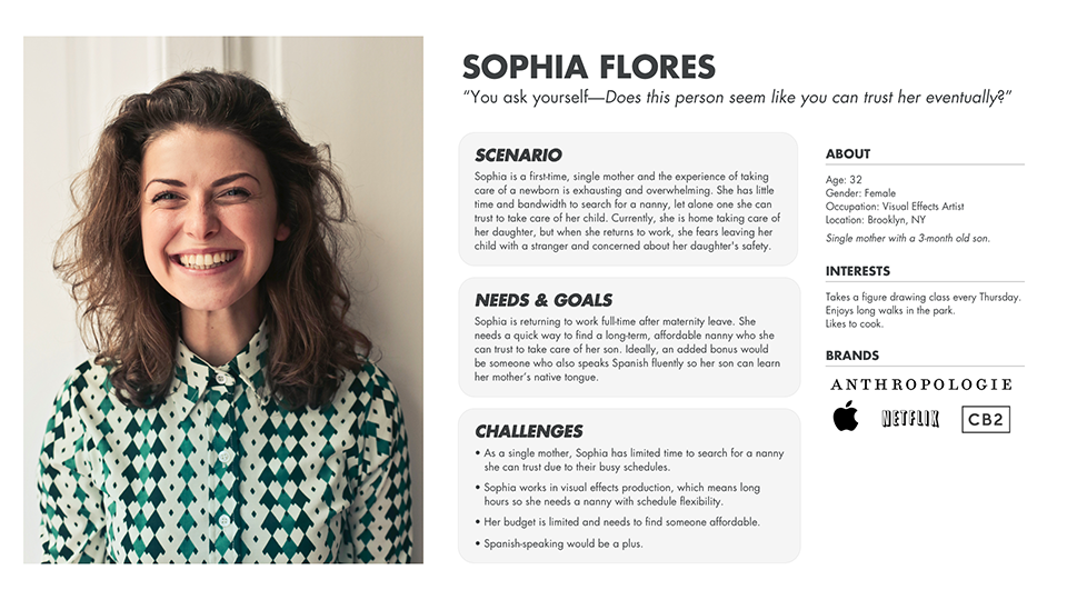
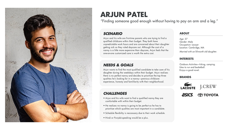
USER PERSONAS
PROBLEM STATEMENT (REVISED)
Parents need a quick way to find a long-term, affordable nanny who they can trust to take care of their kids because they are working full-time.
DIRECT COMPETITORS
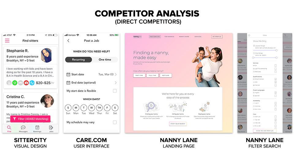
The top childcare apps and services based on user interviews and the current childcare market were Care.com, SitterCity, and Nanny Lane. I thought certain aspects of each of them were well done, such as the visual design of SitterCity’s profiles, Care.com’s scheduling UI, and Nanny Lane’s filter search. Overall, however, the visual design and user experience of all three could be vastly improved.
In addition, all of the parents interviewed had issues with the quality of the search results. There was a feeling of "Quantity over Quality" in all three products, which could be a result of nanny reviews and references not being verified since none of these companies actually provided an employment background check on previous employers and references. Instead, all three gave the option of paying extra for a general background check, which simply was a basic criminal and sex offender check.
Lastly, the parents said they had to cobble together a few different products and searches since there was no reliable all-in-one solution that would deliver a quality candidate.
INDIRECT COMPETITORS
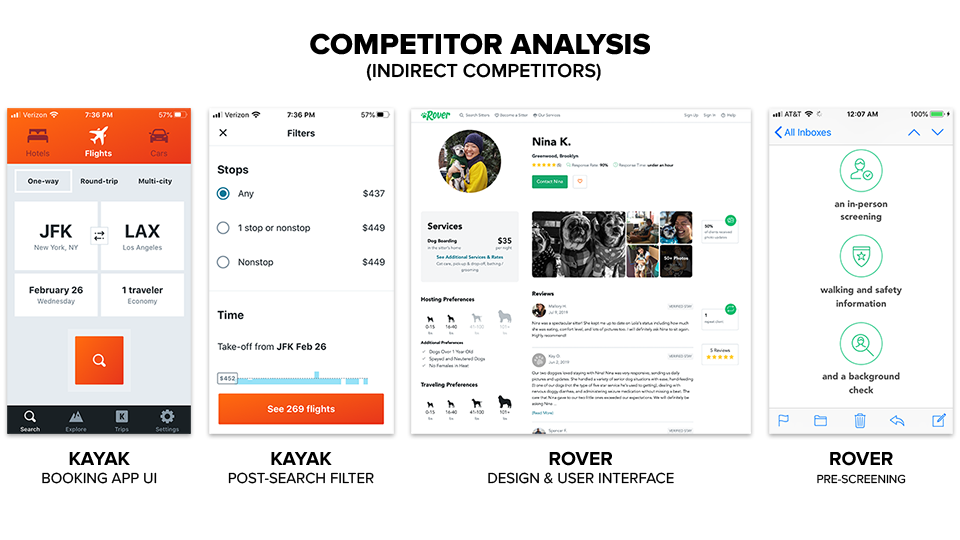
In many ways, Nanna is most akin to a booking app since a great deal of its functionality is focused on the scheduling, booking, and payment of nanny candidates. Kayak stood out as a fantastic UX experience for booking travel. They stripped down an incredibly complex search engine into an easy-to-digest user interface. In addition, the post-search filter is incredibly robust and accessible to allow a user to refine and revise their initial search parameters at any time. Kayak simplified infinite choices into a clean, crisp, and fast user experience.
Generally, not too excited by the current childcare options, I began to look elsewhere for inspiration. Then I discovered Rover. Rover is an app for booking local dog sitters and walkers. Many of the same issues users worry about in finding someone they could trust to take care of their child are the same concerns for pets. The visual design and user experience of this app reflect a company that has thought deeply about how to tackle these problems.
Rover addresses three major issues—trust, safety, and vetting—in an interesting way. They pre-screen all of their candidates in person, provide walking and safety information, and run a comprehensive background check upfront. Also, they only accept about 20% of the candidates who apply, which means by the time a new user searches for a dog-walker, the search results have already been vetted on multiple levels. Rover puts a premium on "Quality over Quantity."
TAKEAWAYS
Current childcare search apps have plenty of room for an improved user experience. A large portion of the UX is focused on scheduling and booking a candidate. Kayak is a great example of how to streamline a complex, multi-faceted search into a user-friendly experience.
Although Rover is an app for finding dog-sitters and walkers, their team has tackled many of the difficult problems of how to create a pool of quality candidates and convey a sense of trust and safety for the user. As a result, they have created an app better at taking care of dogs than nanny apps take care of humans.
How is Nanna different than its competitors?
- We vet all candidates with an in-person screening, background check and provide baby CPR training before you ever click Search.
- Quality over quantity. Only 20% of candidates accepted.
- Refined search engine with filters based on user-backed research of what parents value and need.
- Nanna is an end-to-end service to help guide parents through the complicated search process.
FEATURE PRIORITIZATION (MVP)
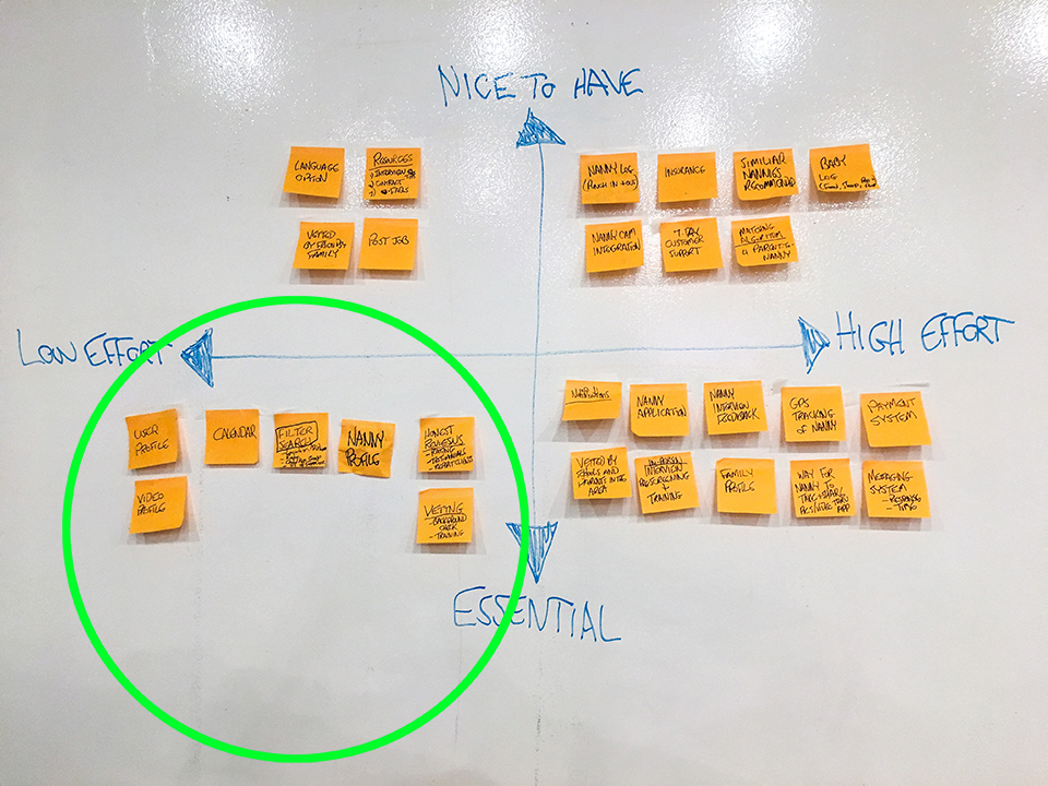
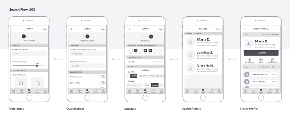
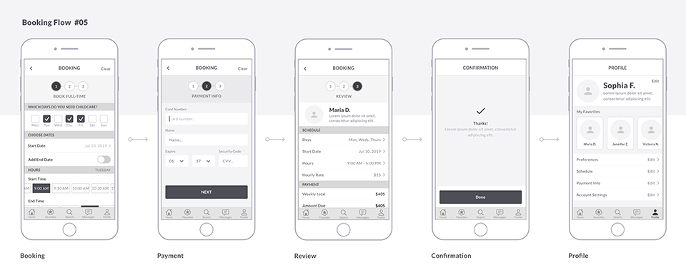
The first stage of the Nanna app was focused on the most essential features, such as user and nanny profiles, search filters, scheduling calendars, and booking.

USER FLOW
The user flow above is the MVP version focused solely on the end-to-end user experience of the parent (user 1). This user flow includes all the stages of contact with the nanny in the hiring process from the initial message to the phone interview, in-person interview, trial day, and payment.
After the parent’s offer is made, the nanny (user 2) has the option to accept or decline.
SITEMAPS
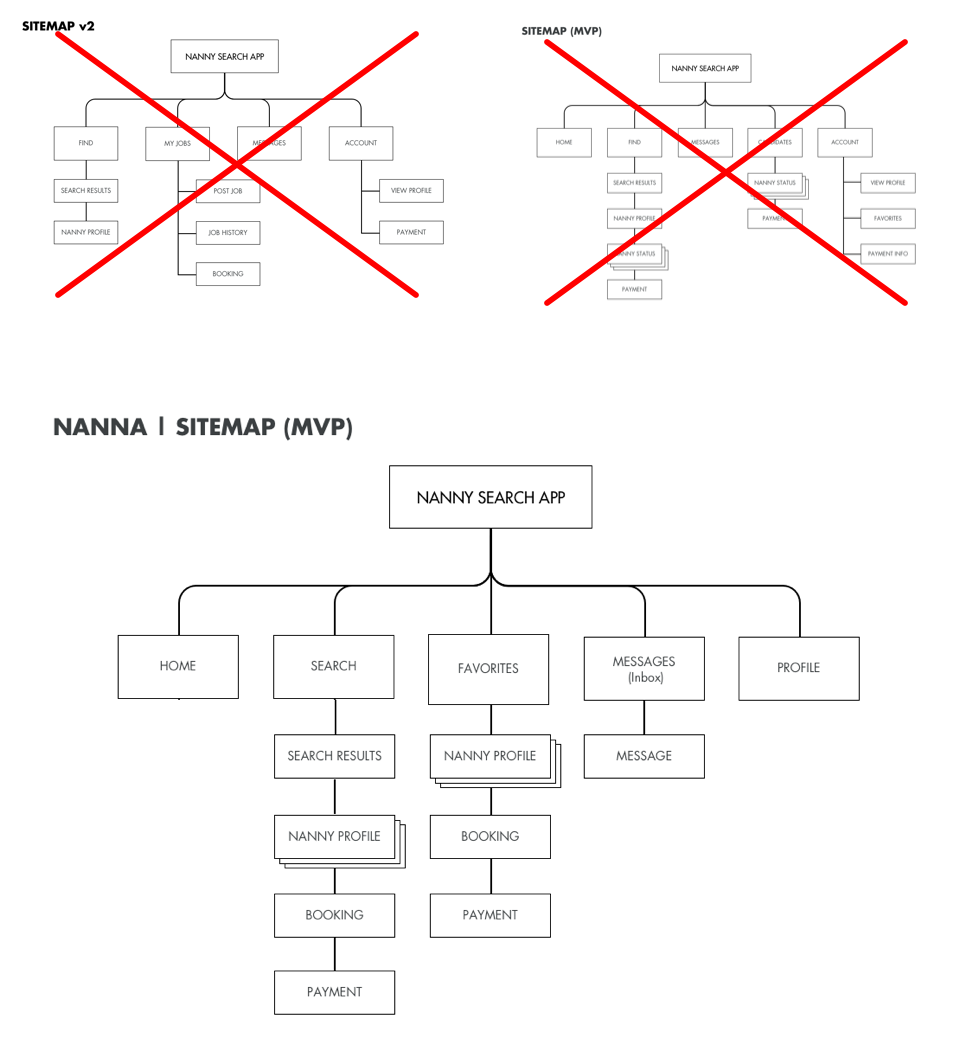
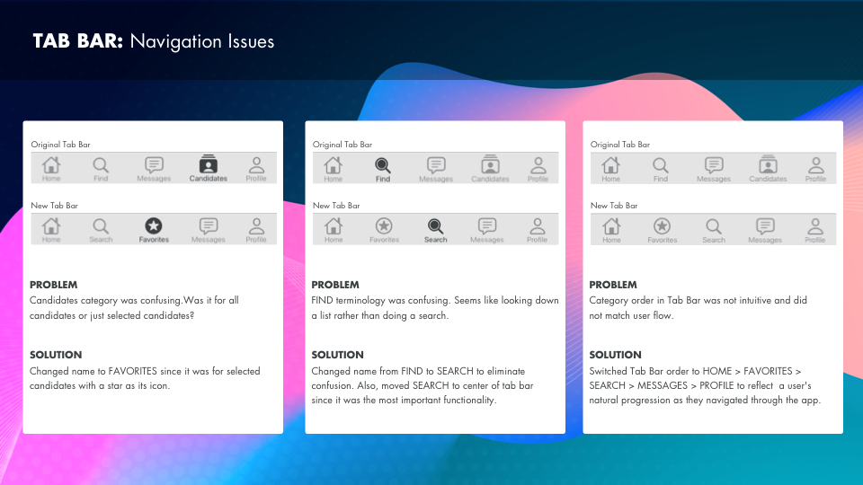
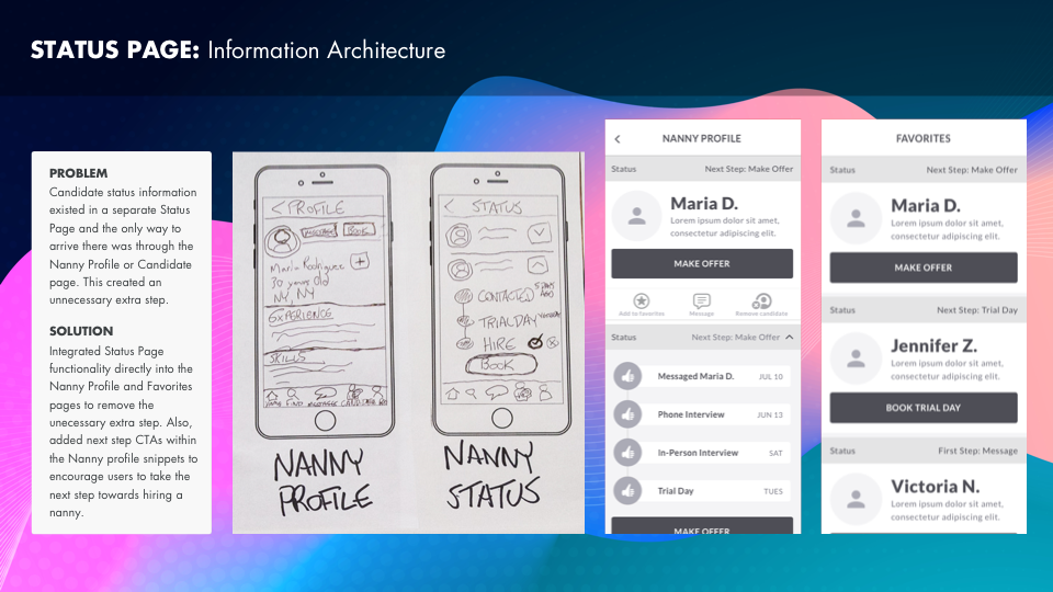
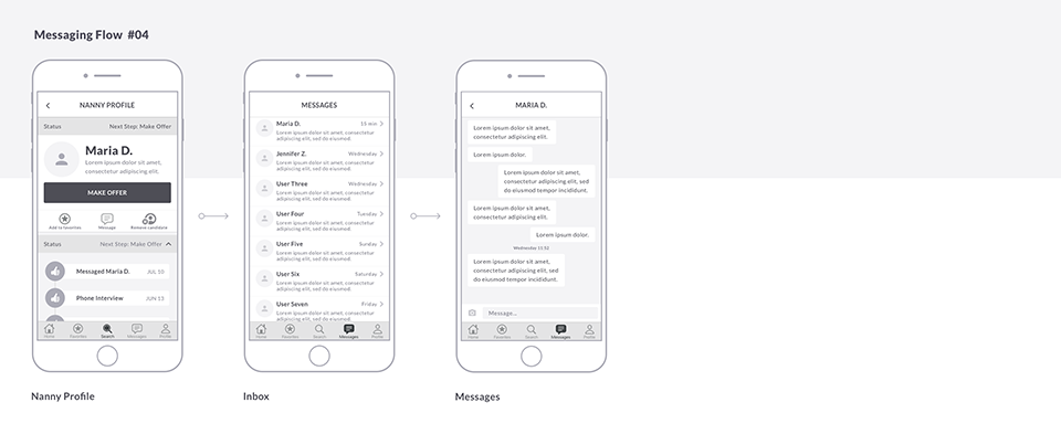
Sitemap was revised and streamlined after a series of card sorts and usability tests. For example, the Candidates category was confusing and evolved into simply Favorites. My Jobs was removed and a Home page was added to orient users upon return visits. The interview status of a nanny candidate was now accessible and nested anywhere their profiles was located.
LO-FI WIREFRAMES
USABILITY TEST FEEDBACK
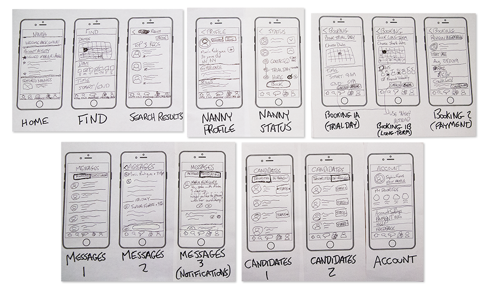
- Labeling of FIND & CANDIDATE sections is confusing.
- Change FIND to SEARCH and move to the center of the tab bar.
- Too many steps, ie: Status Page.
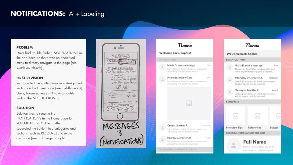
- The notification section is difficult to find.
- Need onboarding to give context.
- Resource material would be nice to provide, ie: Interview Tips.
REVISIONS
MEDIUM-FI WIREFRAMES


PROTOTYPE
NEXT STEPS
- High-fidelity mockups.
- More usability testing.
- A responsive site to pair with the mobile app.
- A dedicated Nanna app focused on nannies looking for work.
MINOR ORBIT STUDIOS
PROJECT
NANNA
ROLE
HEAD OF DESIGN & UX
FOCUS
PRODUCT DESIGN, UX RESEARCH

Nanna is a product inspired by a personal problem I ran into after my first child was born. Everybody says your first child is exciting, terrifying, and exhausting. All of which was absolutely true. Nobody, however, warned me about how difficult the process would be to find the right nanny when I had to return to work.
I wondered if this was an isolated issue. Then spoke with other parents only to discover they also had an incredibly difficult experience finding the right nanny to take care of their child. Nanna is a project that explores and identifies the pain points in the nanny search process and attempts to solve them.
As Product Design lead, I conducted user interviews, defined the problem, ran a comparative analysis, created user flows, wireframes, and an MVP prototype in hopes of designing a product that would simplify and ultimately, alleviate the stress of the childcare search process.
PROBLEM STATEMENT (INITIAL)
Parents need an efficient way to find, connect and vet nannies quickly because, in the absence of a standardized service, the process is long and cumbersome to hire the right fit.

TARGET AUDIENCE
Parents between the ages of 20 - 50 years old.
USER INTERVIEWS
I conducted interviews with five parents from different families, ages ranging from late-20s to 50 years old. They all had young children under the age of 3 years old and have experienced the process of trying to find a nanny to take care of their child. Some were married, while others were separated or single parents by choice.
All parents interviewed lived in either NYC or Boston.
— RESEARCH GOALS —

Understand why did they chose a nanny over other types of childcare, such as daycare.

Discover which personality traits, attributes, and factors were most important to parents when searching for their nanny.

Identify the pain points parents have in the process of finding the right nanny for their family.

Learn about how they went about searching for their nanny and how they felt about the process.
USER INTERVIEWS
— 5 TAKEAWAYS —
TRUST + SAFETY
The #1 concern among parents was can I TRUST this person to take care of my child? Will my child be SAFE with them?
LONG PROCESS
The nanny search is an incredibly TIME-CONSUMING PROCESS. For each prospective nanny, parents have to contact the candidate, conduct a phone interview, followed by an in-person interview, and finally, a trial test day before making an offer.
VETTING
VETTING a nanny is a very tricky process because reviews on childcare sites and forums are often unreliable.
AFFORDABILITY
Childcare can be incredibly expensive. AFFORDABILITY was a concern for all the parents.
SECOND LANGUAGE
A nanny who spoke another LANGUAGE other than English was considered a huge plus. This was seen as a wonderful opportunity for parents to expose their children to other cultures and languages, especially if it was their own heritage and native tongue.
USER PERSONAS


PROBLEM STATEMENT (REVISED)
Parents need a quick way to find a long-term, affordable nanny who they can trust to take care of their kids because they are working full-time.
DIRECT COMPETITORS
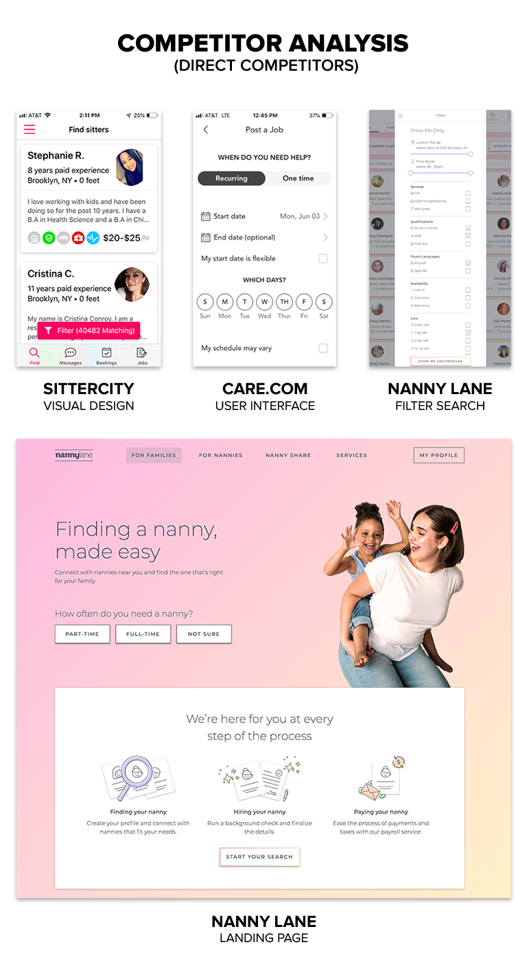
The top childcare apps and services based on user interviews and the current childcare market were Care.com, SitterCity, and Nanny Lane. I thought certain aspects of each of them were well done, such as the visual design of SitterCity’s profiles, Care.com’s scheduling UI, and Nanny Lane’s filter search. Overall, however, the visual design and user experience of all three could be vastly improved.
In addition, all of the parents interviewed had issues with the quality of the search results. There was a feeling of "Quantity over Quality" in all three products, which could be a result of nanny reviews and references not being verified since none of these companies actually provided an employment background check on previous employers and references. Instead, all three gave the option of paying extra for a general background check, which simply was a basic criminal and sex offender check.
Lastly, the parents said they had to cobble together a few different products and searches since there was no reliable all-in-one solution that would deliver a quality candidate.

INDIRECT COMPETITORS
In many ways, Nanna is most akin to a booking app since a great deal of its functionality is focused on the scheduling, booking, and payment of nanny candidates. Kayak stood out as a fantastic UX experience for booking travel. They stripped down an incredibly complex search engine into an easy-to-digest user interface. In addition, the post-search filter is incredibly robust and accessible to allow a user to refine and revise their initial search parameters at any time. Kayak simplified infinite choices into a clean, crisp, and fast user experience.
Generally, not too excited by the current childcare options, I began to look elsewhere for inspiration. Then I discovered Rover. Rover is an app for booking local dog sitters and walkers. Many of the same issues users worry about in finding someone they could trust to take care of their child are the same concerns for pets. The visual design and user experience of this app reflect a company that has thought deeply about how to tackle these problems.
Rover addresses three major issues—trust, safety, and vetting—in an interesting way. They pre-screen all of their candidates in person, provide walking and safety information, and run a comprehensive background check upfront. Also, they only accept about 20% of the candidates who apply, which means by the time a new user searches for a dog-walker, the search results have already been vetted on multiple levels. Rover puts a premium on "Quality over Quantity."
TAKEAWAYS
Current childcare search apps have plenty of room for an improved user experience. A large portion of the UX is focused on scheduling and booking a candidate. Kayak is a great example of how to streamline a complex, multi-faceted search into a user-friendly experience.
Although Rover is an app for finding dog-sitters and walkers, their team has tackled many of the difficult problems of how to create a pool of quality candidates and convey a sense of trust and safety for the user. As a result, they have created an app better at taking care of dogs than nanny apps take care of humans.
How is Nanna different than its competitors?
- We vet all candidates with an in-person screening, background check and provide baby CPR training before you ever click Search.
- Quality over quantity. Only 20% of candidates accepted.
- Refined search engine with filters based on user-backed research of what parents value and need.
- Nanna is an end-to-end service to help guide parents through the complicated search process.

FEATURE PRIORITIZATION (MVP)
The first stage of the Nanna app was focused on the most essential features, such as user and nanny profiles, search filters, scheduling calendars, and booking.

USER FLOW
The user flow above is the MVP version focused solely on the end-to-end user experience of the parent (user 1). This user flow includes all the stages of contact with the nanny in the hiring process from the initial message to the phone interview, in-person interview, trial day, and payment.
After the parent’s offer is made, the nanny (user 2) has the option to accept or decline.

SITEMAPS
Sitemap was revised and streamlined after a series of card sorts and usability tests. For example, the Candidates category was confusing and evolved into simply Favorites. My Jobs was removed and a Home page was added to orient users upon return visits. The interview status of a nanny candidate was now accessible and nested anywhere their profiles was located.
LO-FI WIREFRAMES

USABILITY TEST FEEDBACK
- Labeling of FIND & CANDIDATE sections is confusing.
- Change FIND to SEARCH and move to the center of the tab bar.
- Too many steps, ie: Status Page.
- The notification section is difficult to find.
- Need onboarding to give context.
- Resource material would be nice to provide, ie: Interview Tips.
REVISIONS


MEDIUM-FI WIREFRAMES


PROTOTYPE
NEXT STEPS
- High-fidelity mockups.
- More usability testing.
- A responsive site to pair with the mobile app.
- A dedicated Nanna app focused on nannies looking for work.
