APPLE
PROJECT
APPLE WATCH
ROLE
SENIOR PRODUCT DESIGNER
FOCUS
UX RESEARCH &
PRODUCT DESIGN
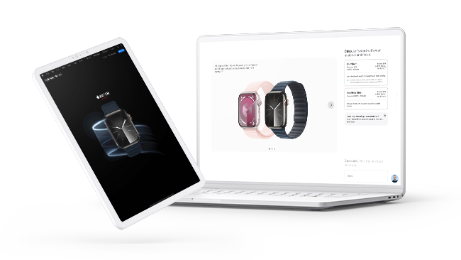
The Apple Watch configuration is the most complex user experience in Apple’s product line. As senior product designer, my job was to help reimagine and simplify the Apple Watch online purchase experience.
I was part of a collaborative, agile design team that conceptualized and redesigned the entire Apple Watch buy flow and watch configuration in the Apple Online Store and Apple Store app.
CHALLENGE
The Apple Watch configuration has 31,700 possible combinations from multiple models, different case sizes, materials, band types, and features. By far and away, the most complicated Apple product to educate and provide decision support for purchase due to the massive number of possible configurations.
How do we improve the existing Apple Watch consumer shopping experience and configuration process?
OPPORTUNITY
Apple Watch buy flow was our opportunity to evolve the end-to-end journey and simplify the watch configuration process.
UX RESEARCH
This project was a huge undertaking that involved tight, cross-functional collaboration between three critical teams—UX Research, Design, and Copy.
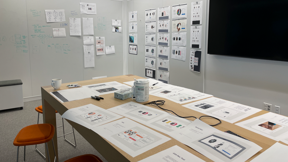
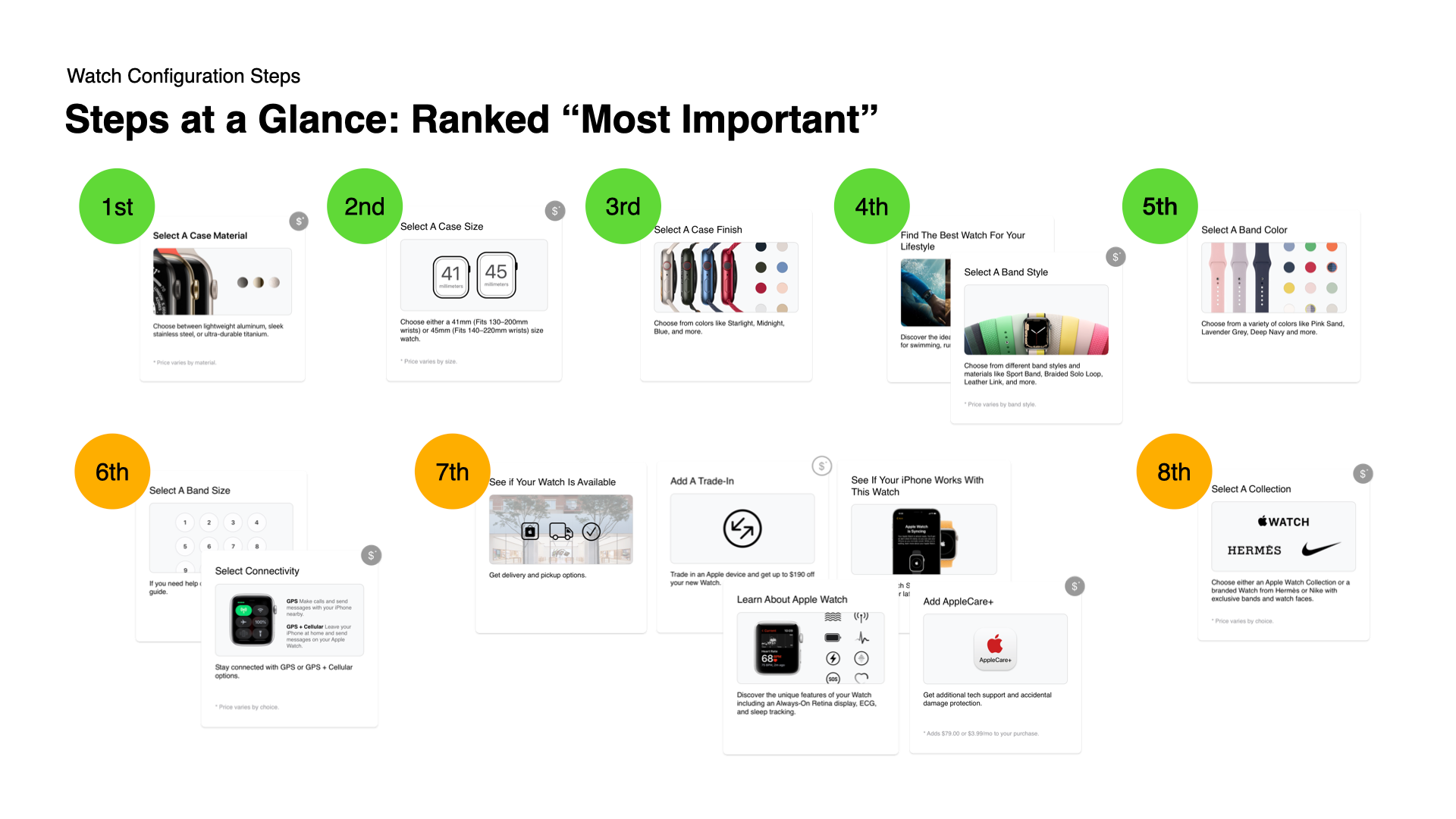
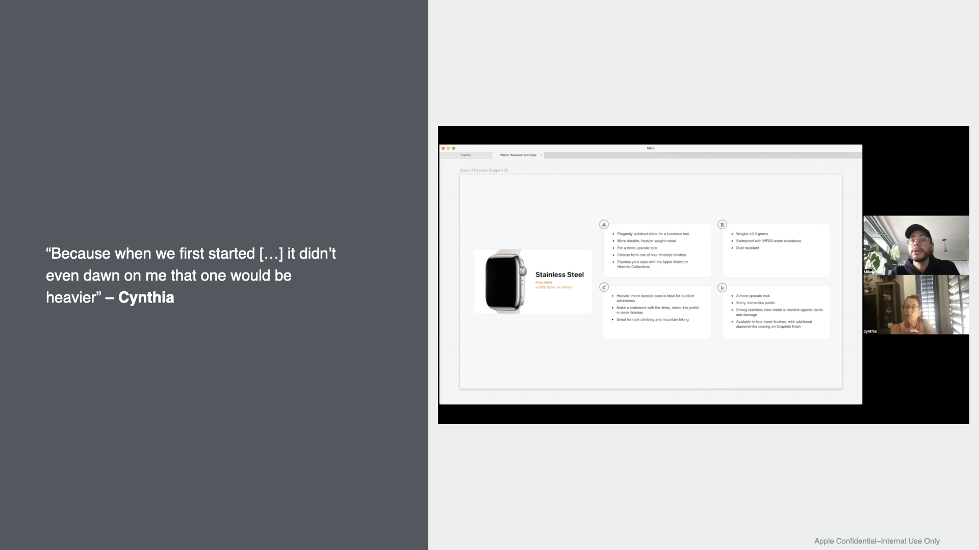
First, we partnered with UX Research to create concept tests to better understand how customers navigate, choose, and configure an Apple Watch.
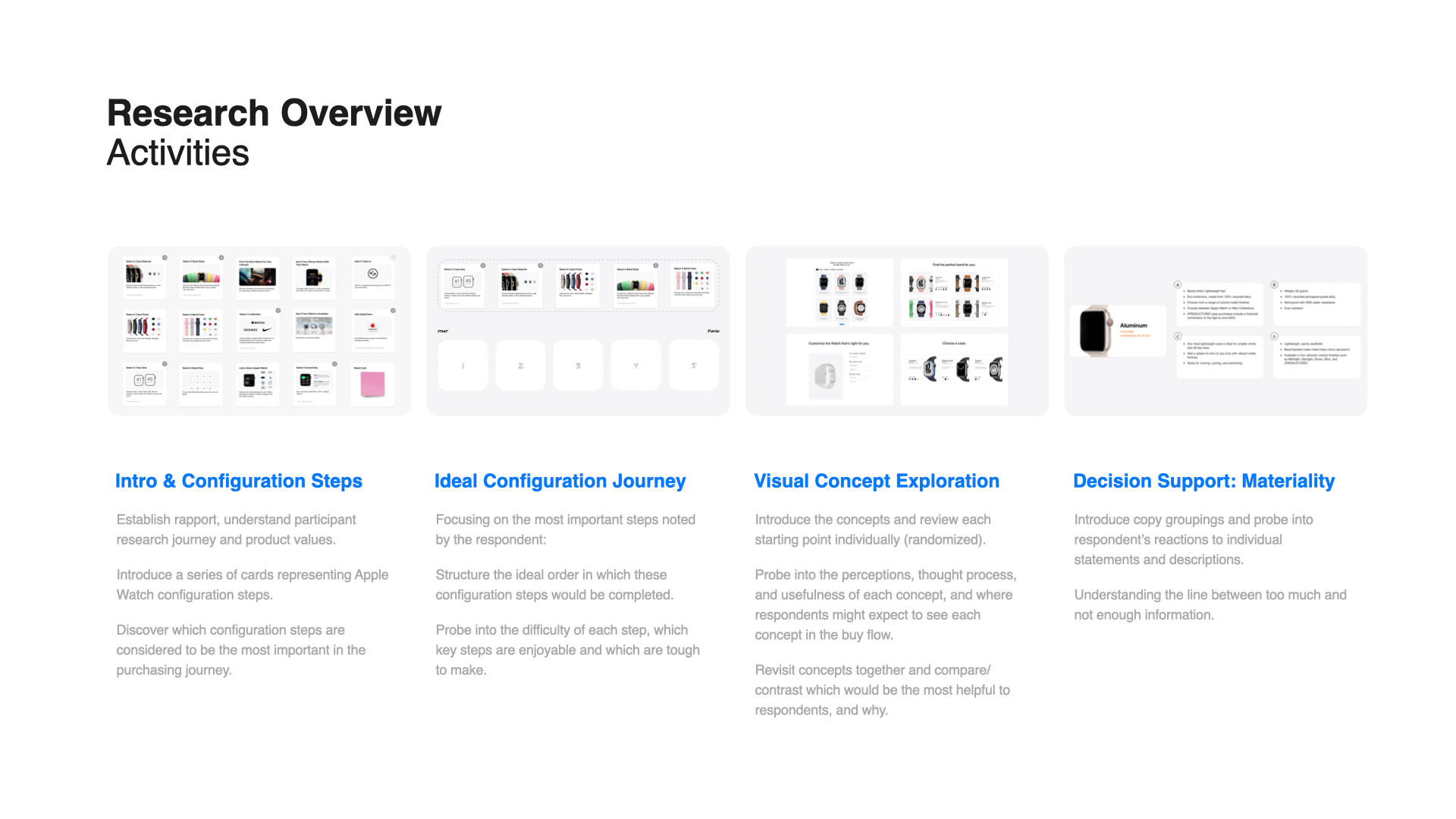
UX Research Insights

Optimize Configuration
Make it easier for the customer to digest and make decisions at every configuration step.

Inspire and Build Confidence
Provide inspiration and learning opportunities for customers to make confident decisions.

Support New and Returning Users
Provide decision support for customers with varying familiarity with the Apple Watch.
APPROACH
As a design team, we took those UX research insights and reimagined the Apple Watch user experience through four phases—Discover, Concept, Envision, and Design. Through close collaboration with the copy team, we reimagined a new ideal user journey with improved decision support.
Original Site (Series 8)
ORIGINAL SITE FLOW
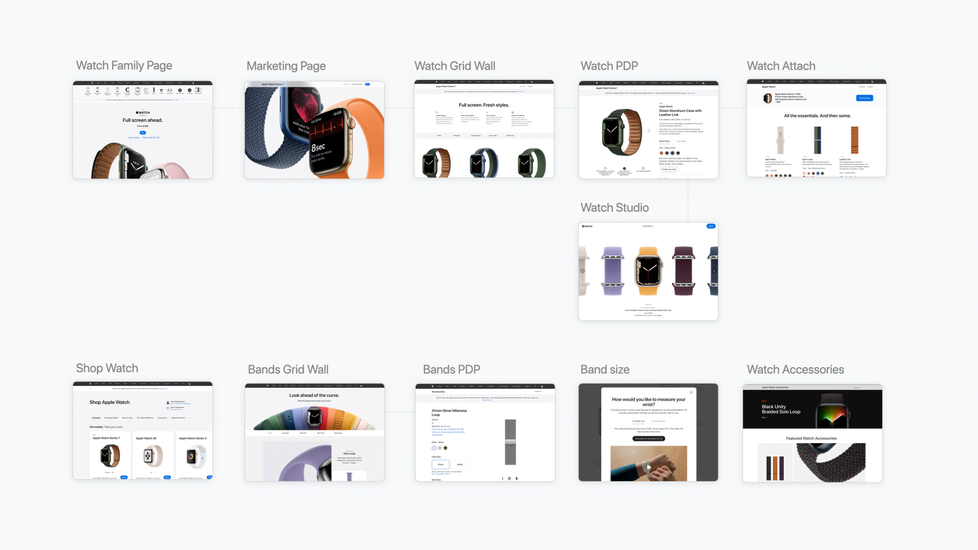
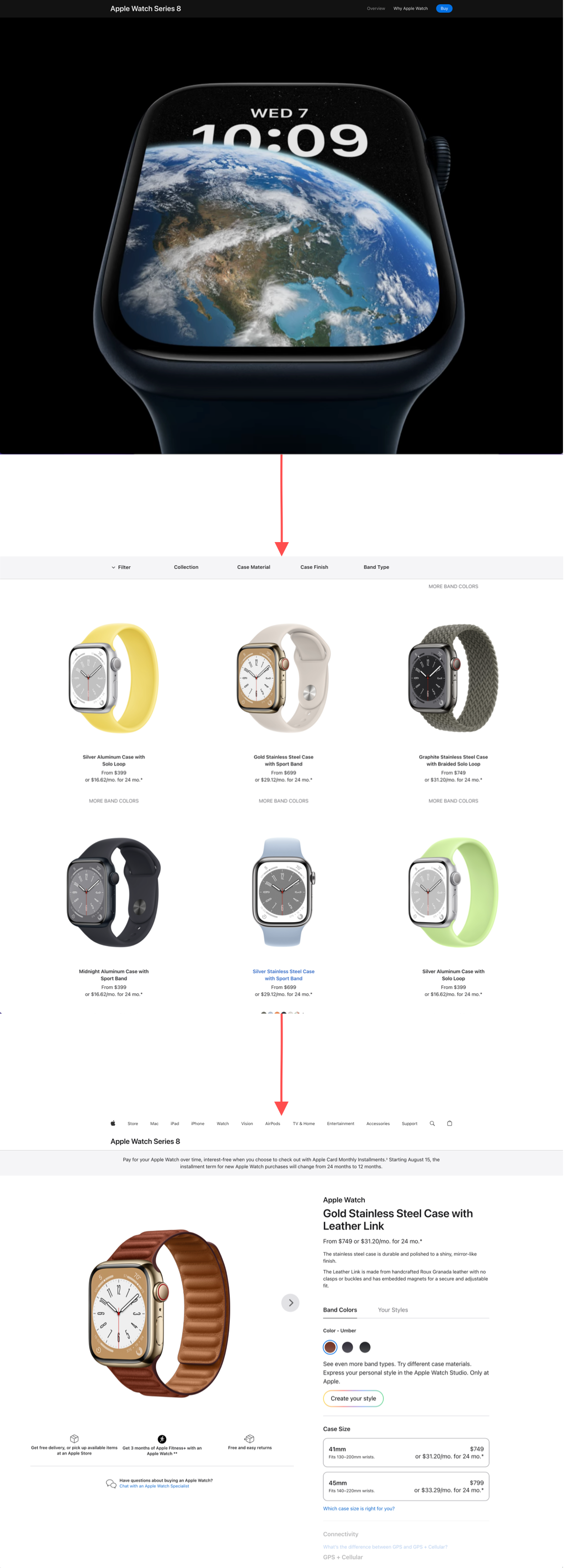
In the original site, the Apple Watch experience began with the Series 8 marketing page (top image). When a user clicked the buy button in the top right corner, they would go to the product page, which was organized as a grid (middle image). The idea was a user would start with a partially configured watch on the grid. Upon clicking the partially configured watch, they would go to the watch configuration page (third image), where they would start the configuration process with an already partially configured watch. The thought behind this flow would be to eliminate a bunch of steps on the final configuration page.
The problem, however, is what if a user had second thoughts and wanted to change their watch configuration?
With this original flow, the user would need to return to the grid product page to choose another "partially configured" watch. Then return to the configuration page to finish the configuration process. This path was incredibly cumbersome and inefficient.
NEW SITE FLOW
The idea in the new site flow was to eliminate the interstitial Grid product page.
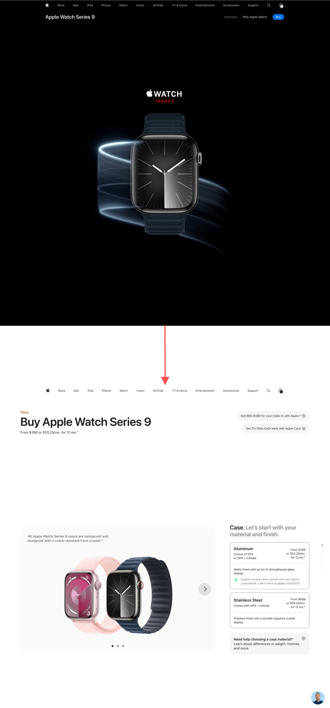
What if after the marketing page (top image) the user was taken directly to a watch configuration page, where the watch could be assembled from start to finish?
With the removal of the Grid product page, the next challenge was to create a configuration experience that consolidated all watch configuration steps on a single page without overwhelming the user.
New Site (Series 9)
WATCH CONFIGURATION
After the elimination of the Grid product page, the watch configuration became the most critical page in the buy flow. We did our deepest UX explorations here to help simplify, streamline, and guide the user through Apple's most complicated product configuration.
The configuration page needed to be a completely new reimagined user experience built from the ground up.
Original Site (Series 8)
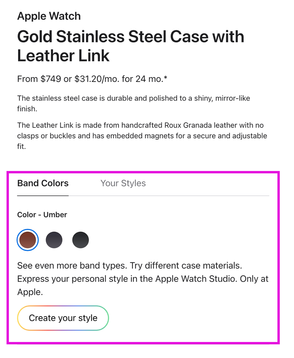
ORIGINAL WATCH CONFIGURATION PAGE
In the original site, the Watch configuration experience began from a partially configured watch. If the user wanted to change the band or case material, they would be pushed to the Studio page through the Create Your Style button, which was a completely different page and user experience.
Or the user could use the back button in the browser to go back to the Grid product page.
Both were very disjointed user experiences.
NEW CONFIGURATION PAGE
The new configuration page allowed the user for the first time to be able to customize the entire watch on one page—from the selection of case material & finish, case size, band material & color, to payment. Users could move backward and forward if they needed to edit their watch without leaving the page.
New Site (Series 9)
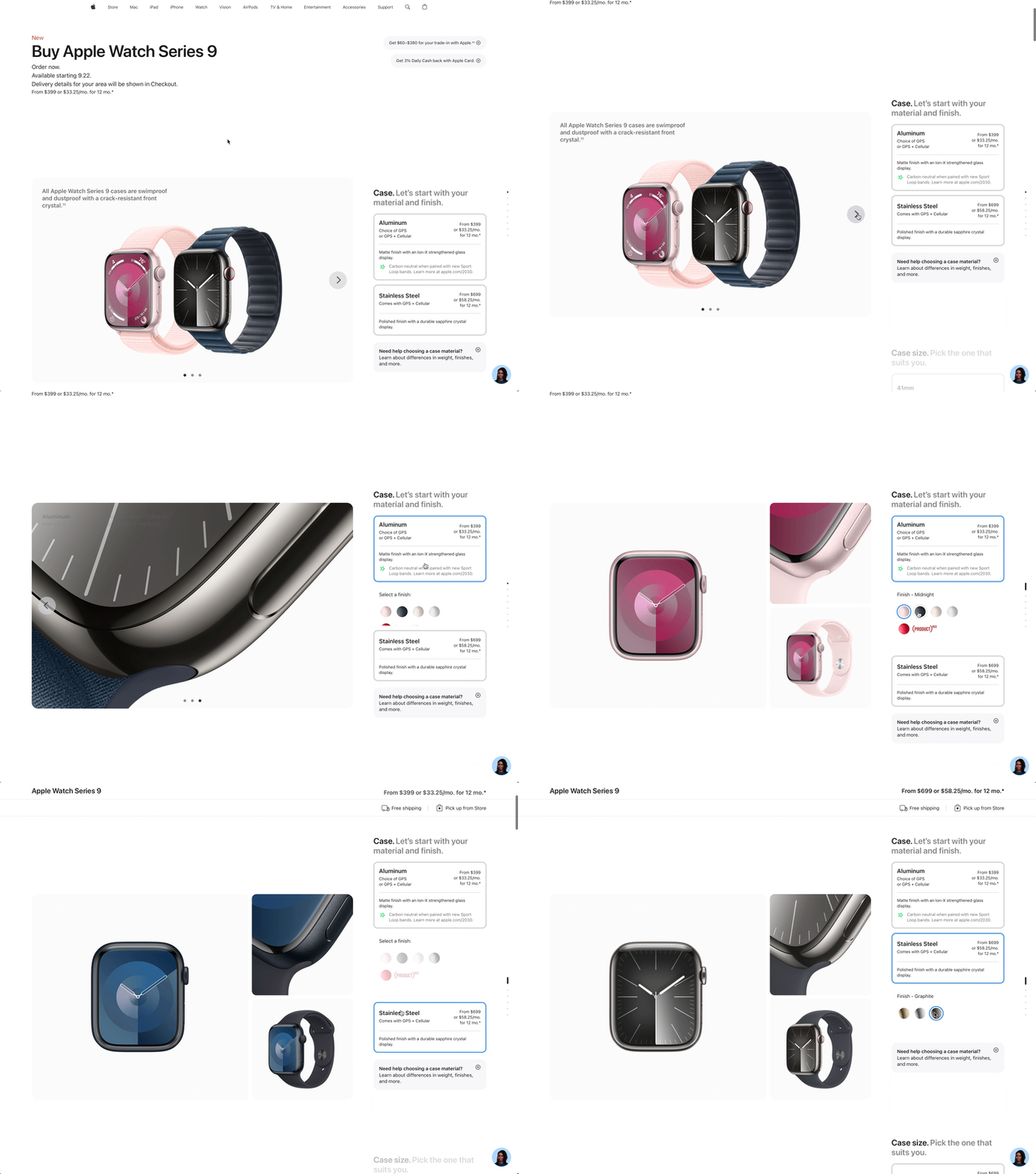
NESTED SELECTORS
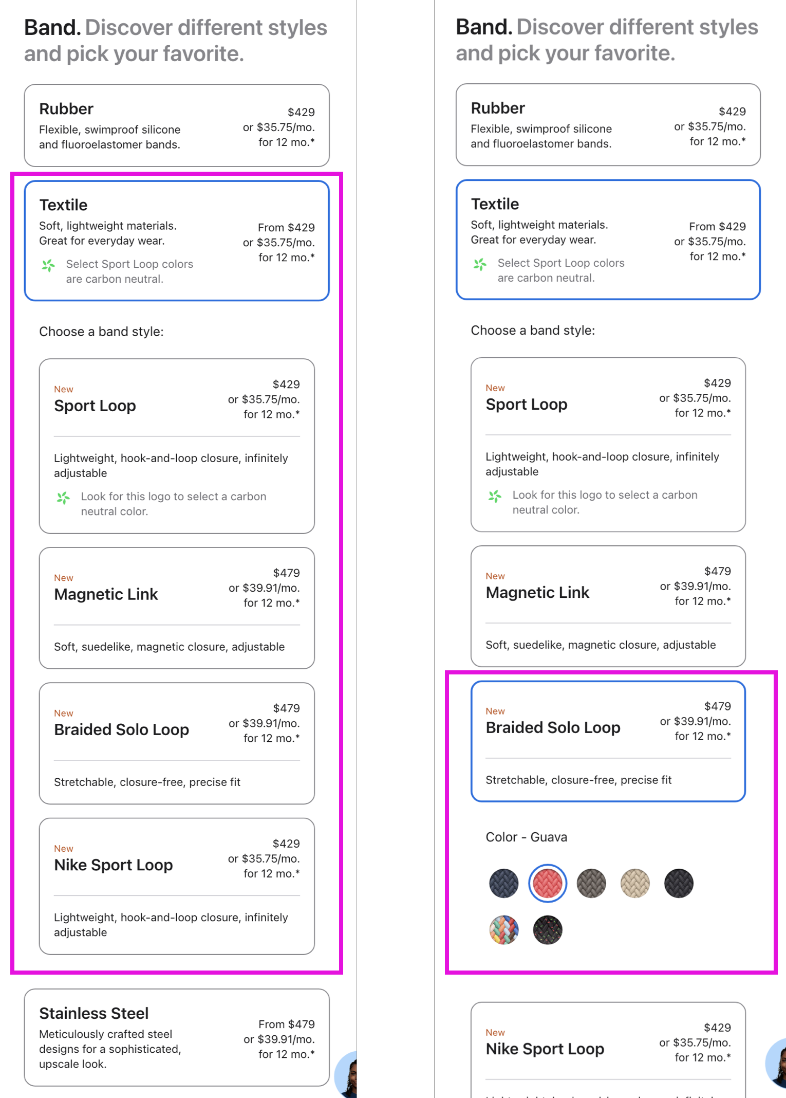
One of the major UX research takeaways was to "optimize configuration." Simplify the steps to make each decision easier. This led to the exploration of nested selectors, which showed only additional contextual information after a selection.
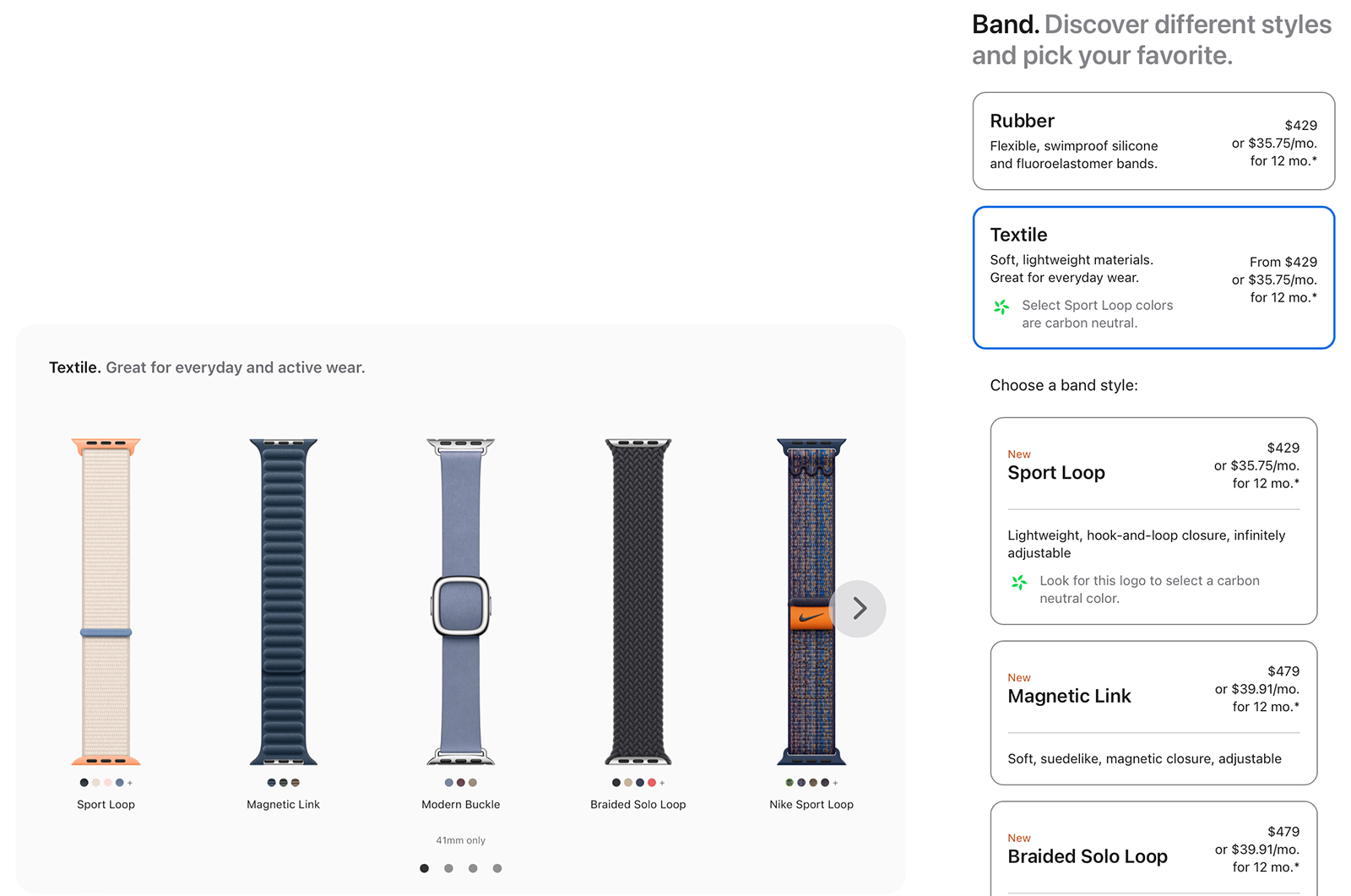
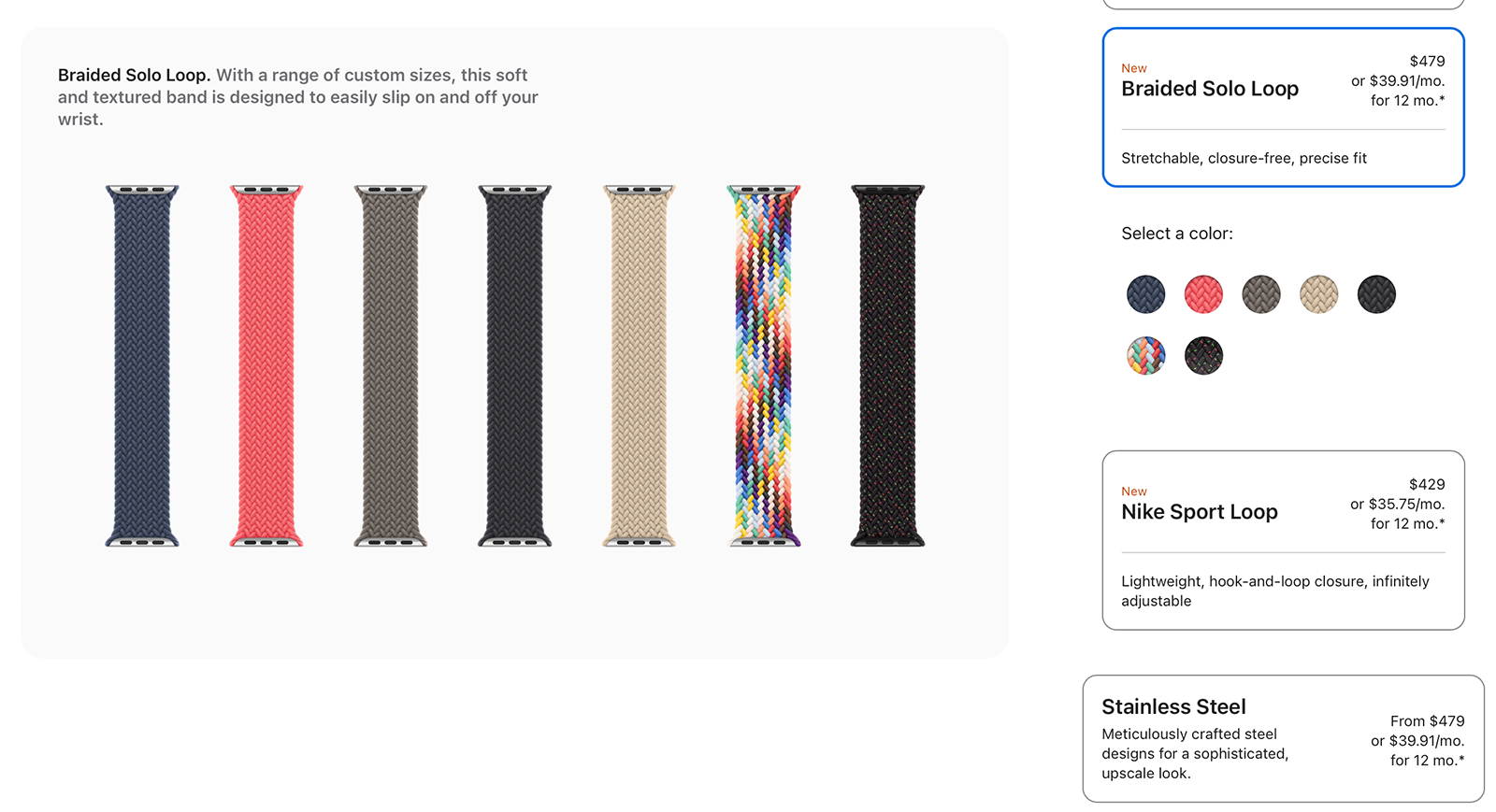
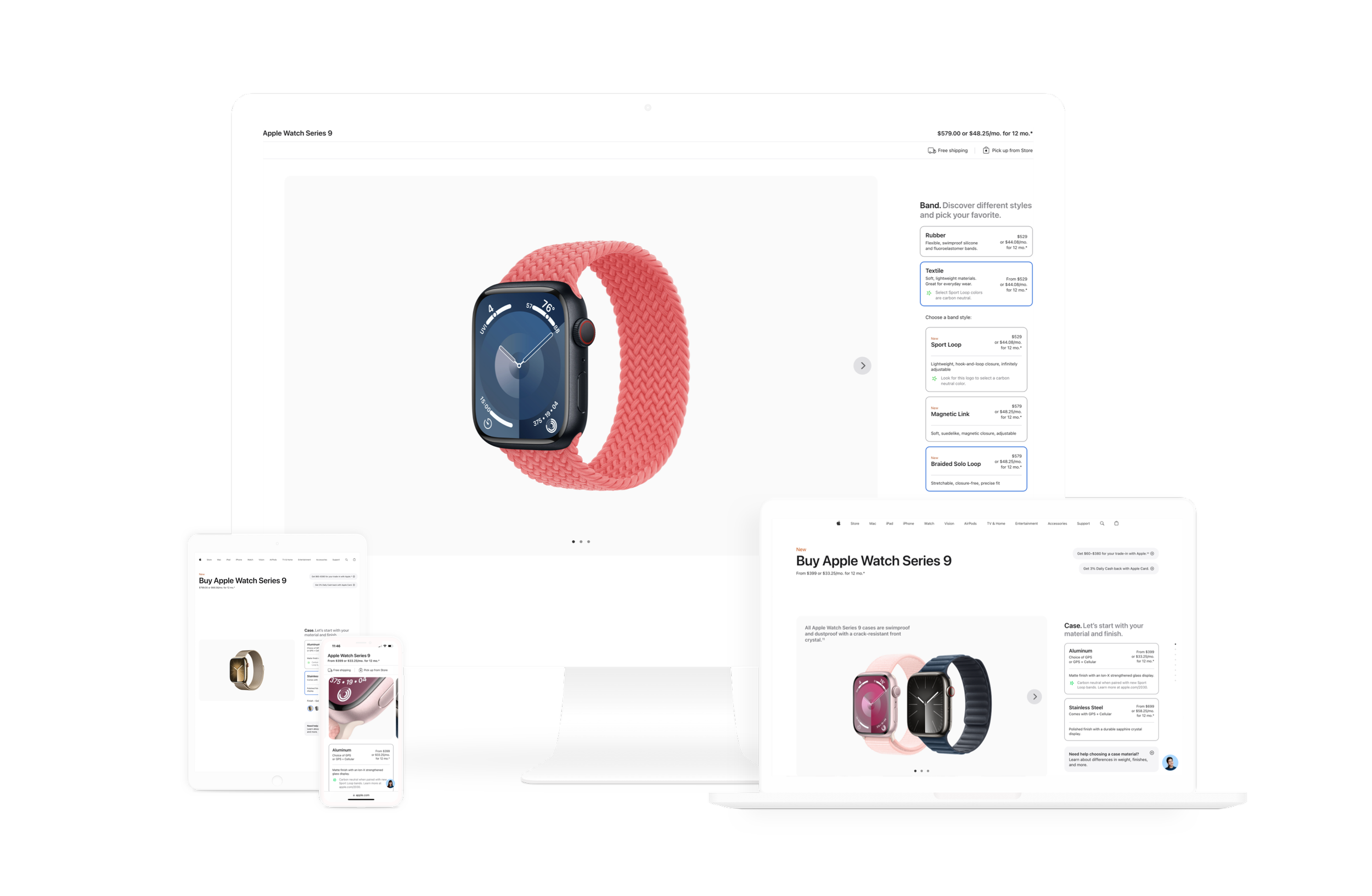
For example, one of the biggest pain points in watch configuration was the selection of band types since there were ten choices. Too many choices for a single selection step, too overwhelming for the user. To simplify the selection process, I worked closely with the copy team to first group bands by material to narrow down the initial selection to simply three choices—Rubber, Textile, and Stainless Steel—as opposed to ten. By grouping the bands by material, the subsequent choices became less overwhelming.
At any point, a user could go back to the top level and choose another band material. The previous nested selectors would collapse as the new nested selection would open. Nested selectors were a powerful way to organize and simplify multi-tiered selections.
A DIFFERENT PRODUCT
The Apple Watch is an entirely different product from the rest of Apple's line. Rather than holding a device or typing on a laptop, this product is worn on the body. Like an article of clothing, customers prefer to try the watch in person before purchasing.
How do we translate the tactile and tangible experience of trying on a watch in the Apple Store to online?
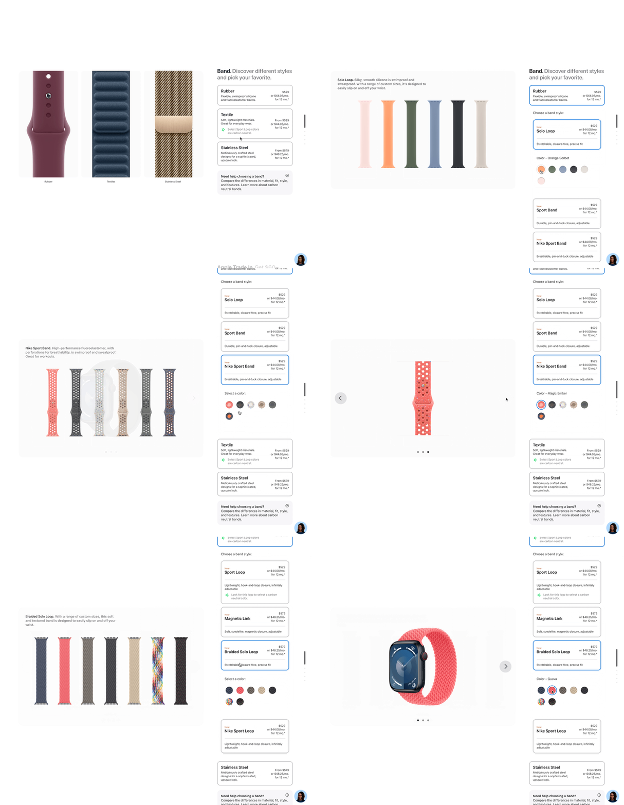
GALLERY IMAGES
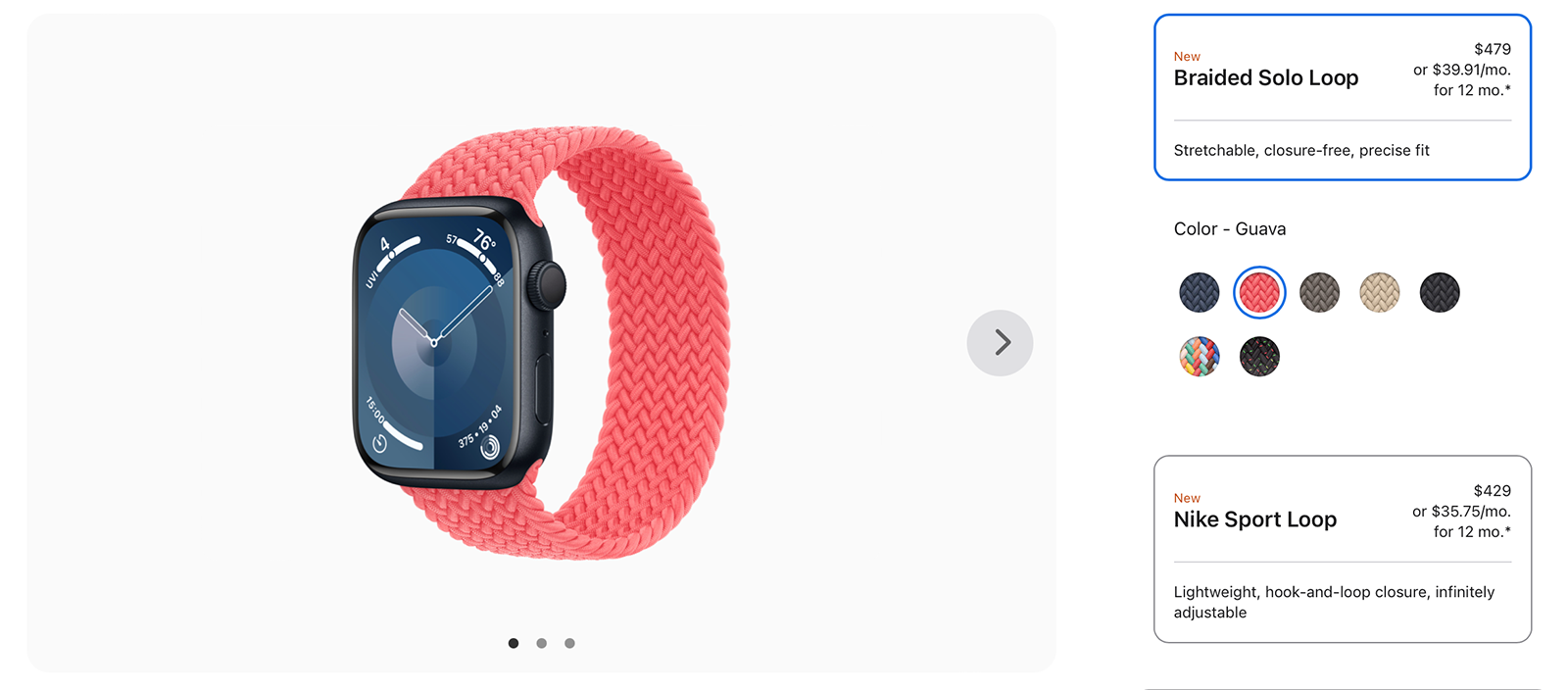
What if every image in the gallery informed the user throughout every step of the configuration process as if trying on the watch in-store? To see the bands laid out with the colors and textures in full detail.
Each gallery image provided contextual information through product images and descriptions for the user at every configuration step.
The nested selectors paired with the gallery formed a powerful tandem to provide the user with only information that added value at each step.
DECISION SUPPORT OVERLAYS
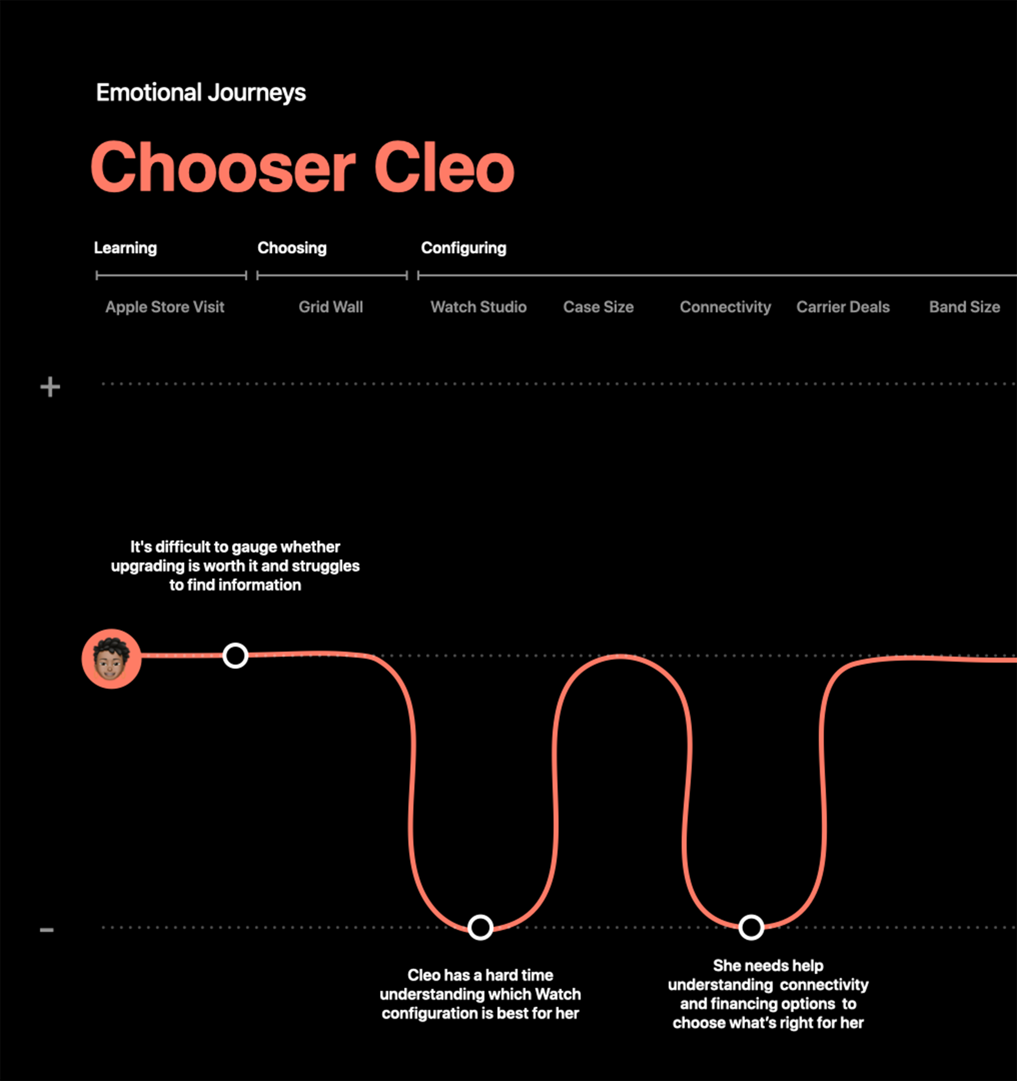
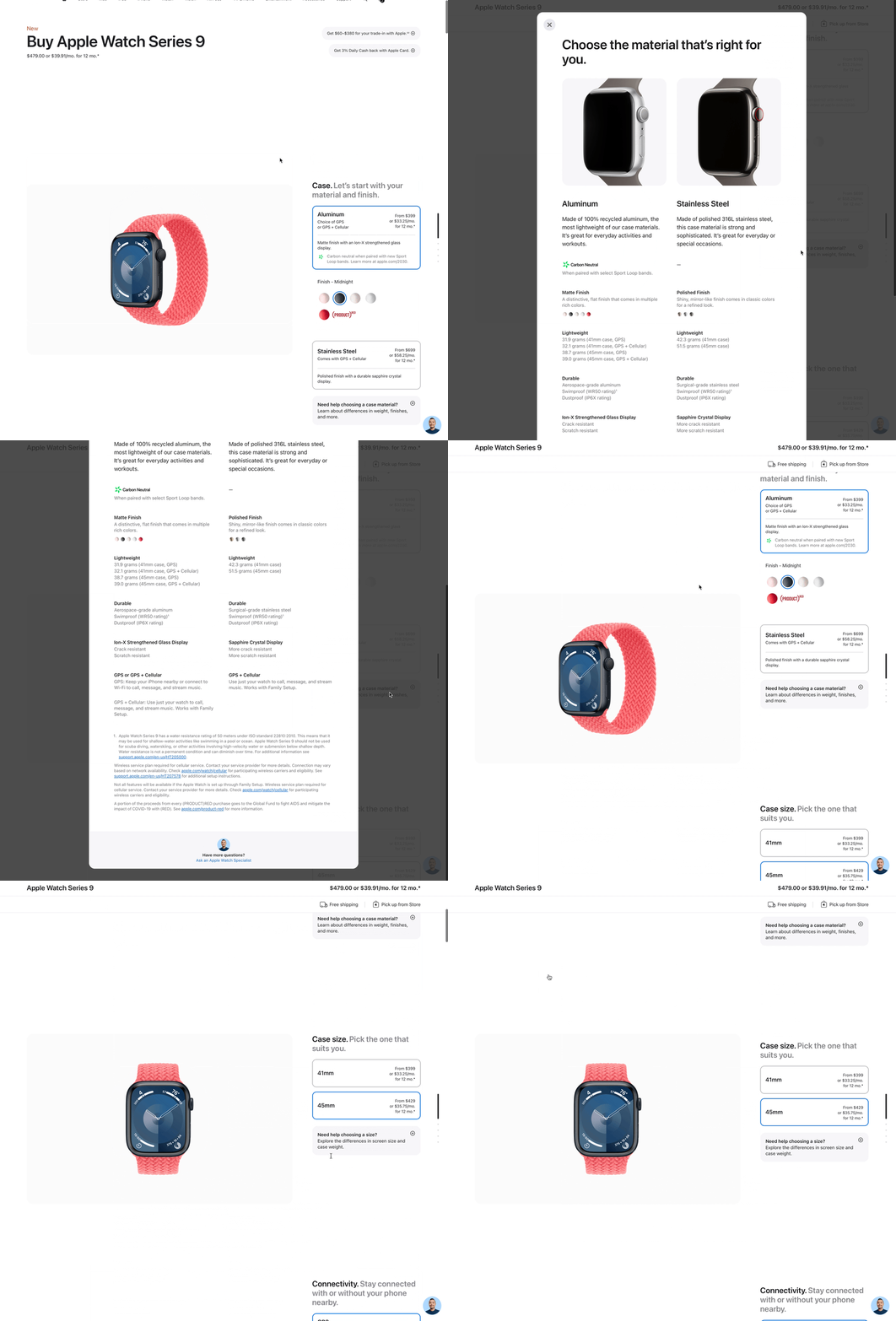
Based on usability tests of the original site, users had similar stress points in their configuration journeys. Quite a few of the steps in the configuration process needed additional information on top of the descriptions in the gallery and nested selectors.
Decision support overlays became a wonderful way to deep dive into comprehensive information about Case Materials, Case Size, Band Types, Connectivity, AppleCare, and Financing Options without the user having to leave the configuration page.
IMPACT
After the new designs launched in June 2023, the number of users to complete the entire watch configuration process from start to finish doubled.
While online Apple Watch purchases increased by 10%.
APPLE
PROJECT
APPLE WATCH
ROLE
SENIOR PRODUCT DESIGNER
FOCUS
UX RESEARCH &
PRODUCT DESIGN

The Apple Watch configuration is the most complex user experience in Apple’s product line. As senior product designer, my job was to help reimagine and simplify the Apple Watch online purchase experience.
I was part of a collaborative, agile design team that conceptualized and redesigned the entire Apple Watch buy flow and watch configuration in the Apple Online Store and Apple Store app.
CHALLENGE
The Apple Watch configuration has 31,700 possible combinations from multiple models, different case sizes, materials, band types, and features. By far and away, the most complicated Apple product to educate and provide decision support for purchase due to the massive number of possible configurations.
How do we improve the existing Apple Watch consumer shopping experience and configuration process?


OPPORTUNITY
Apple Watch buy flow was our opportunity to evolve the end-to-end journey and simplify the watch configuration process.
UX RESEARCH
This project was a huge undertaking that involved tight, cross-functional collaboration between three critical teams—UX Research, Design, and Copy.
First, we partnered with UX Research to create concept tests to better understand how customers navigate, choose, and configure an Apple Watch.


UX Research Insights

Optimize Configuration
Make it easier for the customer to digest and make decisions at every configuration step.

Inspire and Build Confidence
Provide inspiration and learning opportunities for customers to make confident decisions.

Support New and Returning Users
Provide decision support for customers with varying familiarity with the Apple Watch.
APPROACH
As a design team, we took those UX research insights and reimagined the Apple Watch user experience through four phases—Discover, Concept, Envision, and Design. Through close collaboration with the copy team, we reimagined a new ideal user journey with improved decision support.
Original Site (Series 8)

ORIGINAL SITE FLOW
In the original site, the Apple Watch experience began with the Series 8 marketing page (top image). When a user clicked the buy button in the top right corner, they would go to the product page, which was organized as a grid (middle image). The idea was a user would start with a partially configured watch on the grid. Upon clicking the partially configured watch, they would go to the watch configuration page (third image), where they would start the configuration process with an already partially configured watch. The thought behind this flow would be to eliminate a bunch of steps on the final configuration page.
The problem, however, is what if a user had second thoughts and wanted to change their watch configuration?
With this original flow, the user would need to return to the grid product page to choose another "partially configured" watch. Then return to the configuration page to finish the configuration process. This path was incredibly cumbersome and inefficient.
New Site (Series 9)

NEW SITE FLOW
The idea in the new site flow was to eliminate the interstitial Grid product page.
What if after the marketing page (top image) the user was taken directly to a watch configuration page, where the watch could be assembled from start to finish?
With the removal of the Grid product page, the next challenge was to create a configuration experience that consolidated all watch configuration steps on a single page without overwhelming the user.
WATCH CONFIGURATION
After the elimination of the Grid product page, the watch configuration became the most critical page in the buy flow. We did our deepest UX explorations here to help simplify, streamline, and guide the user through Apple's most complicated product configuration.
The configuration page needed to be a completely new reimagined user experience built from the ground up.
Original Site (Series 8)

ORIGINAL WATCH CONFIGURATION PAGE
In the original site, the Watch configuration experience began from a partially configured watch. If the user wanted to change the band or case material, they would be pushed to the Studio page through the Create Your Style button, which was a completely different page and user experience.
Or the user could use the back button in the browser to go back to the Grid product page.
Both were very disjointed user experiences.
New Site (Series 9)

NEW CONFIGURATION PAGE
The new configuration page allowed the user for the first time to be able to customize the entire watch on one page—from the selection of case material & finish, case size, band material & color, to payment. Users could move backward and forward if they needed to edit their watch without leaving the page.


NESTED SELECTORS
One of the major UX research takeaways was to "optimize configuration." Simplify the steps to make each decision easier. This led to the exploration of nested selectors, which showed only additional contextual information after a selection.
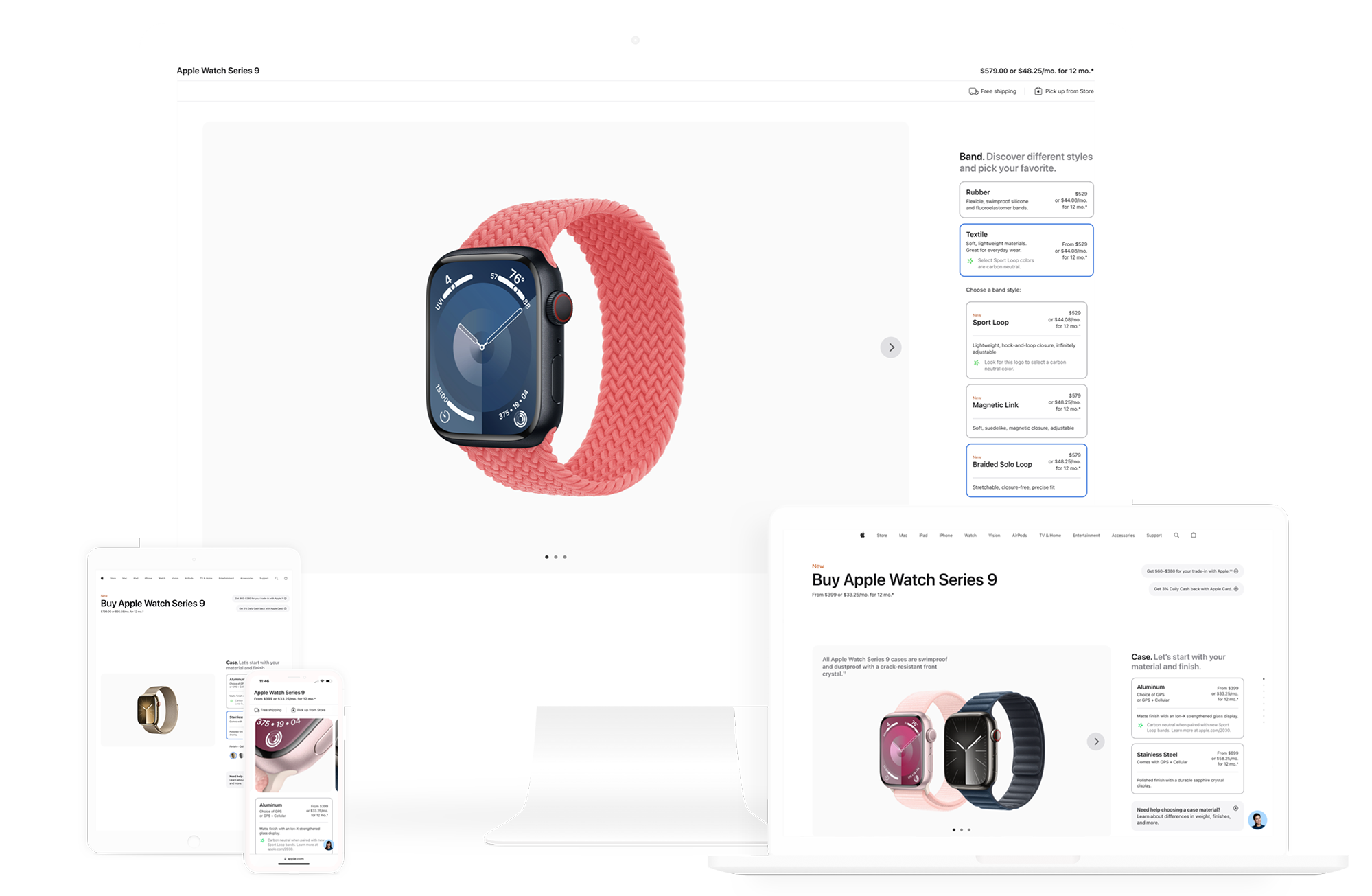
For example, one of the biggest pain points in watch configuration was the selection of band types since there were ten choices. Too many choices for a single selection step, too overwhelming for the user. To simplify the selection process, I worked closely with the copy team to first group bands by material to narrow down the initial selection to simply three choices—Rubber, Textile, and Stainless Steel—as opposed to ten. By grouping the bands by material, the subsequent choices became less overwhelming.
At any point, a user could go back to the top level and choose another band material. The previous nested selectors would collapse as the new nested selection would open. Nested selectors were a powerful way to organize and simplify multi-tiered selections.
A DIFFERENT PRODUCT
The Apple Watch is an entirely different product from the rest of Apple's line. Rather than holding a device or typing on a laptop, this product is worn on the body. Like an article of clothing, customers prefer to try the watch in person before purchasing.
How do we translate the tactile and tangible experience of trying on a watch in the Apple Store to online?


GALLERY IMAGES
What if every image in the gallery informed the user throughout every step of the configuration process as if trying on the watch in-store? To see the bands laid out with the colors and textures in full detail.
Each gallery image provided contextual information through product images and descriptions for the user at every configuration step.
The nested selectors paired with the gallery formed a powerful tandem to provide the user with only information that added value at each step.


DECISION SUPPORT OVERLAYS
Based on usability tests of the original site, users had similar stress points in their configuration journeys. Quite a few of the steps in the configuration process needed additional information on top of the descriptions in the gallery and nested selectors.
Decision support overlays became a wonderful way to deep dive into comprehensive information about Case Materials, Case Size, Band Types, Connectivity, AppleCare, and Financing Options without the user having to leave the configuration page.
IMPACT
After the new designs launched in June 2023, the number of users to complete the entire watch configuration process from start to finish doubled.
While online Apple Watch purchases increased by 10%.